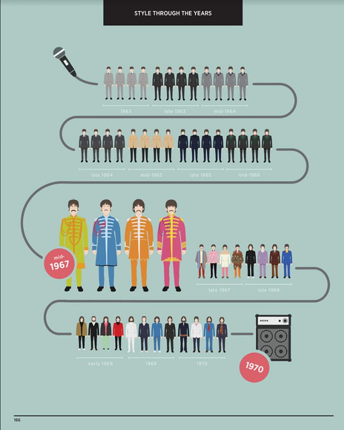
Visualizing the Beatles is filled with stunning full-color infographics, a unique, album-by-album visual history of the evolution of the Beatles that examines how their style, their sound, their instruments, their songs, their tours, and the world they inhabited transformed over the course of a decade.
Combining data, colorful artwork, interactive charts, graphs, and timelines, Visualizing the Beatles is a fresh and imaginative look at the world’s most popular band. Meticulously examining the songs on every Beatles’ album from Please Please Me to Let It Be, UK-based graphic artists John Pring and Rob Thomas deconstruct:
- lyrical content
- songwriting credits
- inspiration for the songs
- instruments used
- cover designs
- chart position
- and more . . . .
They also break down the success of Beatles’ singles across the world, their tour dates, venues, and cities, their hairstyles, fashion choices and favorite guitars, and a wealth of other Beatles’ minutiae. Visualizing the Beatles also includes illustrations involving the conspiracy theories of the “Paul is dead” hoax as well as A-to-Z lists of every artist or performer who has ever covered a Beatles’ song.
Comprehensive, entertaining, and packed with fun facts, Visualizing the Beatles is a wonderful introduction for new fans and a must-have for devotees, offering a new way to think about this extraordinary band whose influence continues to shape music.


