From dancing bears to metal monsters, the world of band logos and mascots is a wild ride through pop culture, fantasy, and what happens when musicians say, “Hey, what if we had a skeleton riding a tank?” These little symbols become shorthand for everything a band represents—and sometimes, they’re just weird and awesome for weird and awesome’s sake.
Here are some of the most iconic and mysterious band mascots, logos, and album art you’ve always wondered about—until now.
1. Iron Maiden’s Eddie
He’s been a zombie, a cyborg, a pharaoh, and a space alien—and that’s just in the ’80s. Eddie, Iron Maiden’s terrifyingly cool mascot, first showed up on their debut album and never left. He’s basically their sixth member… if their sixth member was undead.
2. The Grateful Dead’s Dancing Bears
No, they’re not high. Well, maybe a little. These colorful, happy bears debuted on the back cover of History of the Grateful Dead, Volume One (Bear’s Choice) and were originally a tribute to sound engineer Owsley “Bear” Stanley. They don’t actually dance—but in your mind, they do.
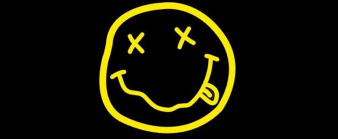
3. Nirvana’s Smiley Face
That lopsided grin and squiggly eyes? It’s been on more dorm walls than actual paint. Kurt Cobain allegedly designed the iconic smiley for a 1991 party flyer, and it stuck. Whether it’s a stoner, a symbol of grunge, or both—it’s unmistakably Nirvana.
4. Rolling Stones’ Tongue and Lips Logo
Designed by John Pasche in 1970, this famous tongue is actually inspired by the Hindu goddess Kali, not just Mick Jagger’s, uh, confidence. It’s loud, bold, and somehow still sticking out at everyone five decades later.
5. Led Zeppelin’s Four Symbols
No band name. No album title. Just four mysterious glyphs, each chosen by a member of the band. The most famous is Jimmy Page’s “Zoso” symbol—which he still won’t fully explain. It’s like rock ’n’ roll’s own secret handshake.
6. Radiohead’s Bear Logo
First appearing during their Kid A era, this glitchy, smiling bear was designed by Stanley Donwood and Thom Yorke. It’s cute, creepy, and confusing—just like the album. Some say it’s a comment on consumerism. Others just love the sharp teeth.
7. Pink Floyd’s Prism on The Dark Side of the Moon
It’s just a triangle and some light, right? Nope. Designed by Hipgnosis and George Hardie, this simple prism became one of the most recognizable album covers ever. It’s science, it’s beauty, and somehow… it sounds like the album.
8. Megadeth’s Vic Rattlehead
A skeletal figure with his eyes, ears, and mouth clamped shut? That’s Vic Rattlehead, metal’s edgiest mascot and a walking embodiment of “see no evil, hear no evil, speak no evil.” He’s been thrashing alongside Dave Mustaine since the band’s debut.
9. Queen’s Royal Crest
Designed by Freddie Mercury himself, the crest includes the zodiac signs of all four members: two lions, a crab, and two fairies. Add a crown and a phoenix and you’ve got a royal logo fit for rock royalty. Freddie didn’t just sing—he branded.
10. Daft Punk’s Helmets
They never gave us facial expressions—just two space-age helmets that turned two French guys into global icons. The helmets became a symbol of mystery, coolness, and what happens when robots decide to make funky disco music.
11. The Misfits’ Crimson Ghost
That skull face? It’s not original—but it’s unforgettable. Taken from a 1946 movie serial, The Crimson Ghost became the Misfits’ forever mascot and punk’s most ghoulish grin. It’s like Halloween never ended.
12. The Beatles’ Apple Logo
Before there was a tech giant, there was Apple Corps—the Beatles’ own multimedia company. The logo is literally just a Granny Smith apple… but thanks to John, Paul, George, and Ringo, it became rock’s most literal fruit of success.
13. Pearl Jam’s Stickman
Drawn by bassist Jeff Ament for their Alive single, the wavy-armed stick figure became an unofficial mascot for angsty teens everywhere. It’s simple, weirdly triumphant, and says everything without saying anything at all.
14. Slipknot’s Nonagram
Nine members. Nine points. One chaotic energy. Slipknot’s star-like symbol reflects the unity and darkness of their masked madness. Looks like geometry class got a lot more intense.
15. The Who’s Target Logo
It’s a mod icon, a pop-art statement, and one of rock’s coolest logos. With the Union Jack, arrow, and bold lettering, it’s pure British swagger. The Who didn’t invent the bullseye—but they definitely hit it.
16. Green Day’s Heart Grenade
Featured on American Idiot, this logo looks like romance with a short fuse. It perfectly sums up the album: angry, emotional, and ready to explode. Bonus points if you had it on a T-shirt in high school.
17. AC/DC’s Lightning Bolt
It splits their name in two and zaps like a power chord. The bolt has been part of AC/DC’s identity since 1977’s Let There Be Rock—and yes, it goes with everything. Even school uniforms.
18. Weezer’s Flying W
It’s nerdy, angular, and somehow feels like math rock even when it’s not. The “flying W” is inspired by the old Wonder Woman logo but flipped and filtered through power chords and awkward charm.
19. Van Halen’s Winged Logo
Originally designed by Dave Bhang, the VH with wings took off in the ’80s and never looked back. It’s fast, flashy, and everything a shredding guitar solo should look like in graphic form.
20. Korn’s Backward “R”
Written by Jonathan Davis as a kid, the backward “R” was meant to look like a child’s handwriting. It fit perfectly with the band’s raw, emotional sound—and became a nu-metal badge of honor.


